Notes from #responsiveconf – Dan Donald
Published onDesigning Evolution Elements
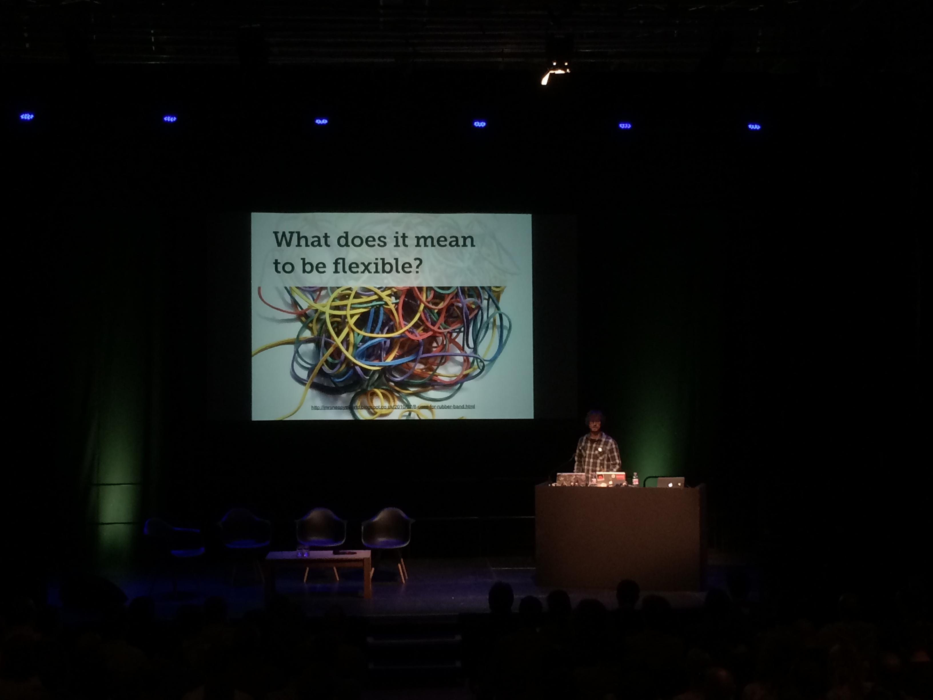
RWD is open to interpretation, even the nature of breakpoints.
Device or content-oriented?
Device-agnostic = universality.
User-agent string tells the server nothing, but what would it change if you did know?
Modularity – atomic design.
Breaking things down – Pattern Lab.
Element Queries. What can the element do in its own context?
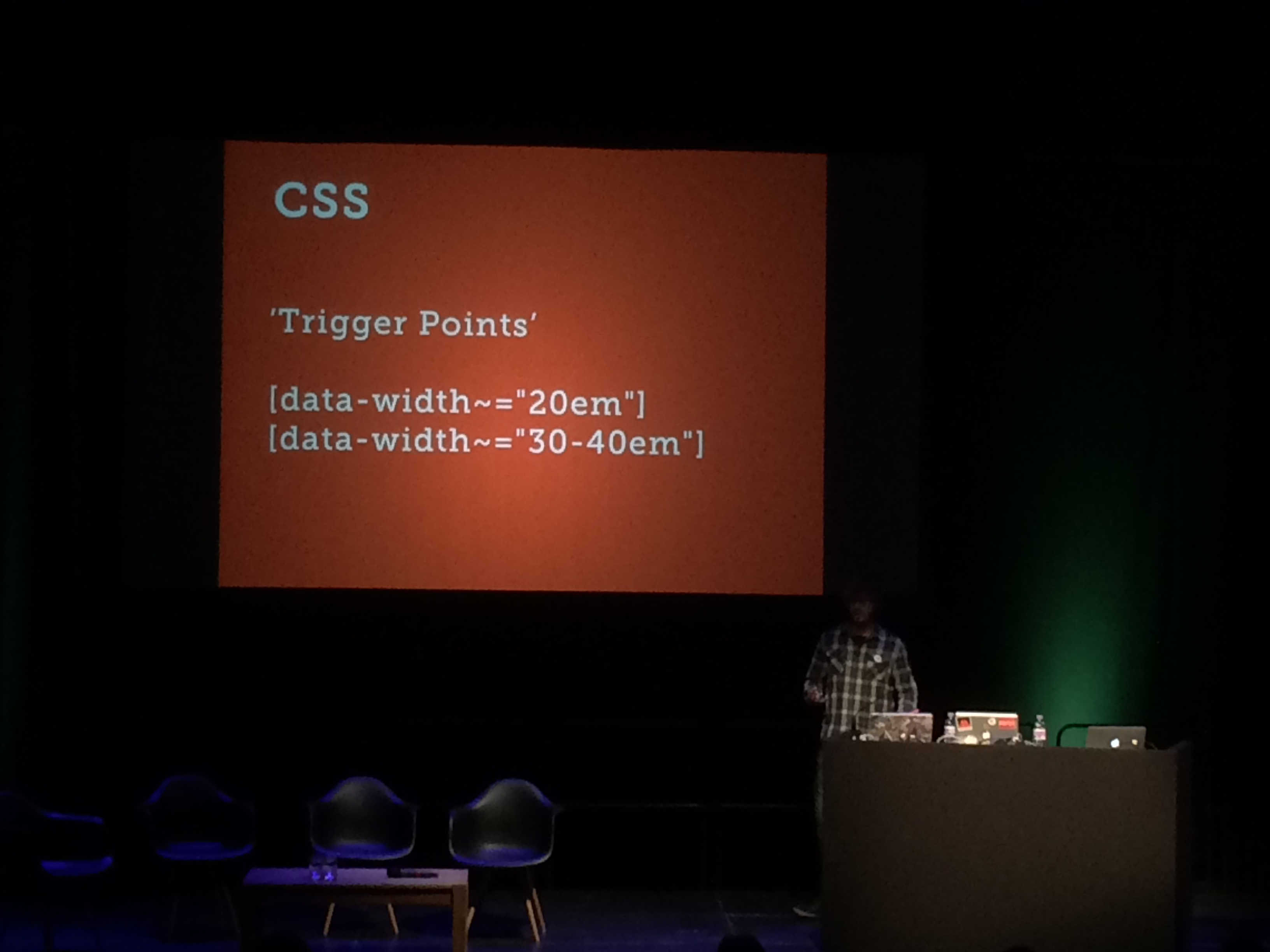
Trigger points. JS/PHP detection using normal CSS.
Start with the most primitive form. How could the layout of a module evolve? All progressive enhancement.
Ideal for responsive images – the image references its own container, not the viewport.
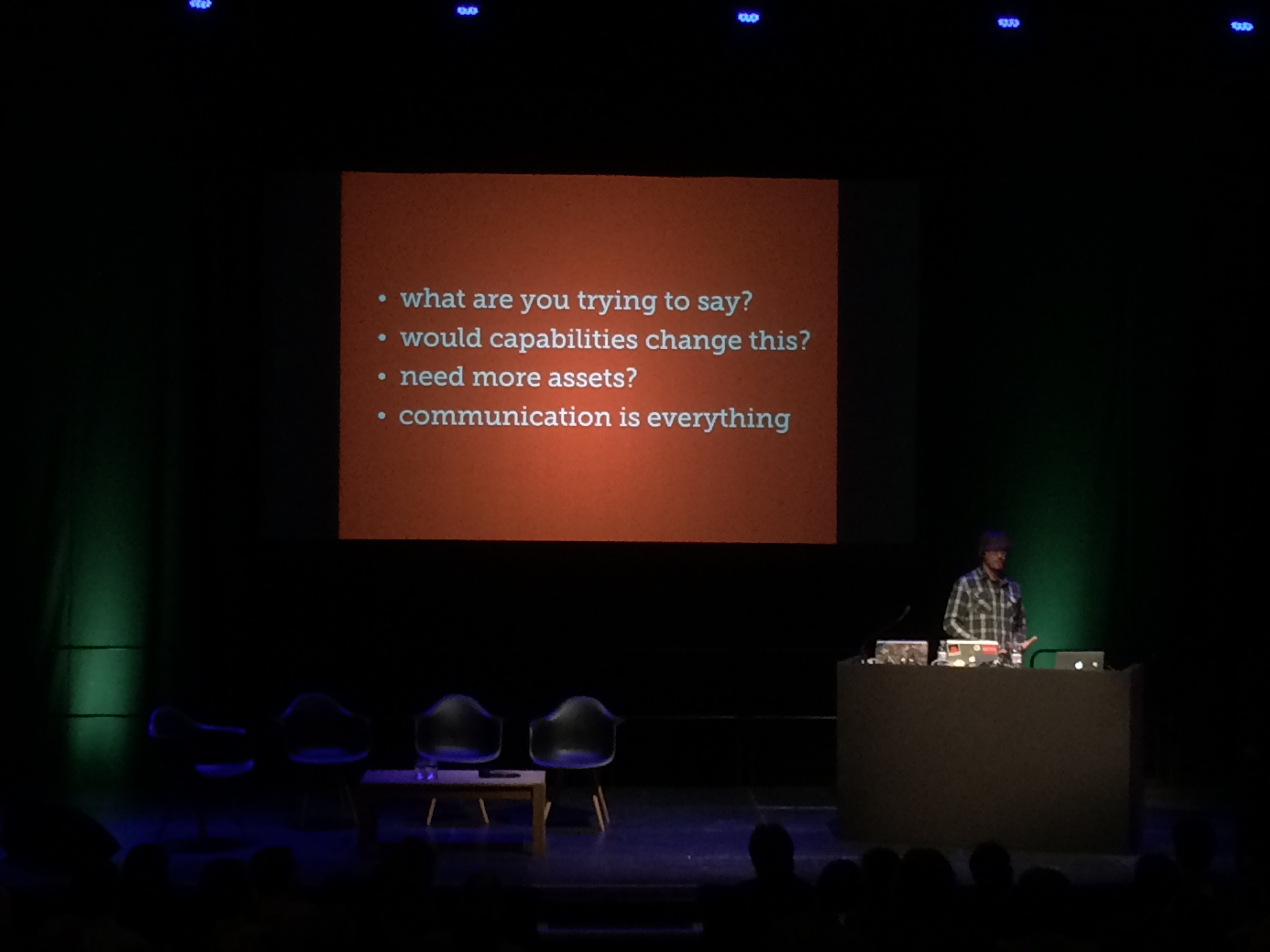
Should we use this now? Need to be responsible.